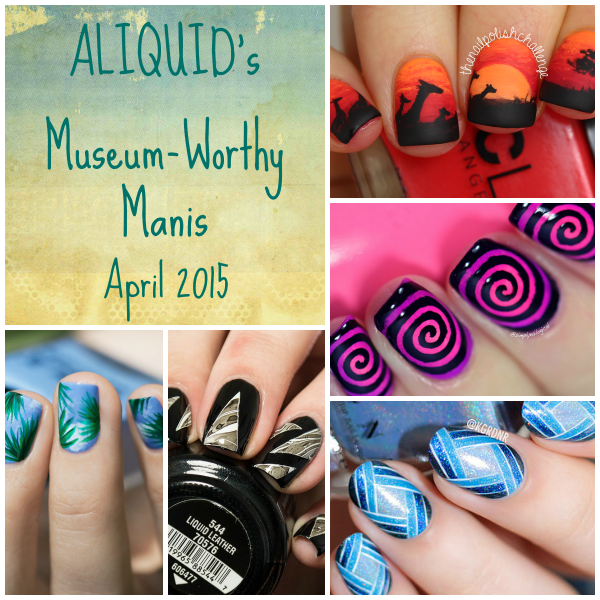
Hey! I'm back, of course, with my favorite nail art from last month! Make sure to go give the original artists props on their posts!
1. Kenya Inspired Nail Art by The Nail Polish Challenge
I immediately knew I had to include this one because it reminds me of The Lion King, which is my favorite Disney movie (I even did some Lion King nail art a while back)! I love the messiness of the background gradient--it looks like clouds.
2. Round Gradient Cyclone by Simply Nailogical
Whoa, psychedelic! What a great idea to use a swirl decal over a radial gradient (which is a technique I really need to try someday).
3. Monochromatic by Lacquerstyle
This one actually has a very similar structure to the previous mani, but more elegant instead of in-your-face. And of course it's freehanded, which totally amazes me! I love the way the interlocked stripes draw your eyes in multiple directions.
4. Black/White by BibbediBabbediBeauty
I find it's very rare that a watermarble mani looks classy, but it absolutely does here. I mean, black makes everything classier! And the decal shapes look very modern.
5. Palm Leaves by Pshiiit
This mani looks like a fabric print to me. So soft and summery! And it looks like something I could possibly do myself!
Honorable mention: Wide Open Landscape by PiggieLuv


All are just amazing!
ReplyDeleteOoooh, I hadn't even seen BibbediBabbediBeauty's! That is a really, really cool take on watermarble + negative space!
ReplyDeleteI love that Kenya inspired manicure ;)
ReplyDeletex
These are all so great! I agree about the last...at first I thought it was a fabric on her nail tips!
ReplyDeleteI love adding 3D elements to my work! Also the fact that you describe things like "It's kind of like if the Borg went Renaissance." is why you're my fav blogger. :DOutlook Support now your problem can easily resolve by this website.
ReplyDelete